6/16/2011

Opening of the Highline' Section 02'

This project makes me so incredibly happy. It makes use of a disused elevated old railway system in NYC and turns it into a fantastic civic space through which one gets an alternative view of the streets of new york.

Instead of demolishing this disused infrastructure, landscape architects and urban designers Field Operations along with architects Diller Scofidio + Renfro and planting designer Piet Oudolf collaborated together to celebrate civic life in one of the worlds most famous metropolises with this elevated park corridor. Remaking an old and once vital part of the industrial city into a new, vital part of the public city.

perspective view, merging vegetation and the built environment around it, giving an indication of what sort of space you can expect upon visiting the Highline.


The design celebrates the human scale, interaction between people, interaction between people and the surrounding built environment, interaction between people and industrial heritage and the interaction between people and a more romantic planting scheme that could be argued somewhat removes the visitors from the very city that this piece of infrastructure once served. As the people at dezeen describe it:


The park accommodates the wild, the cultivated, the intimate, and the social. Access points are durational experiences designed to prolong the transition from the frenetic pace of city streets to the slow otherworldly landscape above.

Top view of the Highline Park, some vegetation found on the elevated level is in fact tree canopies planted on ground level. image via dezeen

Rudanko+Kankkunen - Vocational school in Sra Pou, Cambodia.

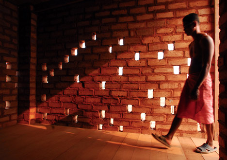
This is such a meaningful project by finish architects Rudanko+Kankkunen. The school was constructed with hand-dried blocks of local soil and built by the local community. via dezeen
Window/Door Shutters, image by architects

 Using materials found closeby and having the locals building the school as a design process makes this project close to the heart and it gives it more soul.

I love the colours of the window shutters, they are vibrant and contrasting to the terracotta coloured bricks.

Facade, image via architects
Student looking through the woven window shutters, image via architects
It would've been nice to have added the surrounding lot to the design aswell. For this sort of project I would imagine having a workshop with the children and planting perhaps fruit trees and other edible crops to the school yard.

Holes in wall to let sunlight through and also aid in ventilation of the building, image via dezeen

Urban Interventions

My urban intervention Crate[or] is now online for your perusal here. Feel free to email or comment on the project. It forms a part of ongoing design research that I am conducting into approaching the city at a human scale when discussing urban development and the understanding of the forces that play out in the city.

Crate[or], photo by author

6/02/2011

IKEA's 'Homemade is Best' - The architecture of Baking

Ikea's 'Homemade is Best' cook book contains 30 traditional Swedish baked goods recipes with a twist. Each recipe is complimented by an image of the ingredients before they are mixed together and baked. It is a wonderful documentation of the process of baking. NO, actually, it is the process of arranging the ingredients of baking.

Napoleonbakelser, before

Napoleonbakelser,after

The ingredients are placed in a decorative composition adjacent to each other and this image is then paired with the end result. But if I was to imagine the scenery of when I bake and cook in my kitchen, the image is a far cry from the stylized and glorified images of this book. It would be interesting to contrast this work by documenting the 'real' process of making and juxtaposition the images next to each other to further the notion of documenting a design process. Because, it is only the ingredients and the end result that is on display here, and the actual MAKING part seem to have been left out.

Kanelbullar (Cinnamon Buns) before


Kanelbullar (Cinnamon Buns) after
Still, a cool idea from the ad-agency Forsman & Bodenfors.

The homemade is best book serve the purpose of drawing more people towards the kitchen and obviously to IKEA's showroom. That is beside the point. These days, people seem to be more obsessed with the end result and product that they forget the beauty in the making of things. This is why I love this project. It starts to talk about the intimate and domestic in a beautiful way. It is a world away from fast-food outlets and mass-production of food. 
Mandelmusslor (Almond mussels), before

Mandelmusslor (Almond mussels), after


Yet the irony is that this work is meant to draw people towards the mass-production of the IKEA kitchen. As if IKEA is saying: OK, so here we have it, we'll let you go back to domesticity and the art of making unique food in your own home so that you don't have to worry about getting your consciousness dirty with the immorality of mass-produced food. Leave the mass-production to us and you'll be a happy peach. 

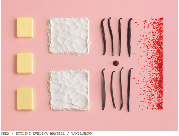
vaniljhorn (vanilla horn) before,
from here

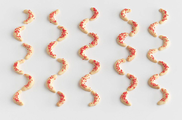
vaniljhorn (vanilla horn) after, from here

Looking at the homemade is best work, makes me a happy peach but I just want to reconfigure the work to include the process of making it as well.

Now I know the point was not that at all, it is just the way I think. Originally, the ad company made the cookbook, created an iphone app that traced your exercise and told you when  you'd done enough exercise and earned the calories to eat one of the recepies. Clever, isn't it. Apparently, the ad reached 40 million people without IKEA spending a cent on media and promotional costs..somehow...I am contributing to the publicity too. Hmmm.

Here's a link to the movie.

I think I might just visually suggest how this process would look if applied to the components of an architectural project. Watch this space.

5/22/2011

String Spectacular

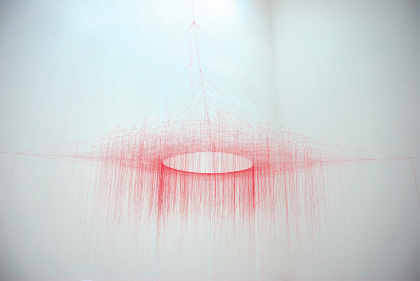
full view, from designboom
Akiko Ikeuchi knots silk thread in a process that takes up to a month for gallery installations. The works are room size scales and the work is so delicate and subtle which I think reflects the process of making it and the personality of the artist. The knots seem to reflect the daily disruptancies that one face, one by one, Ikeuchi documents these experiences into a a narrative of collective moments. One knot is one moment in time, brought together into a story. Stunning.

detail of installation showing the knots, via here


This is a google translation of the artist's own description of the work, from Japanese to English. I believe the translation is not completely accurate but I reckon you still get the just of the intent, in fact, it is very beautiful.


ー four axonemal Azuma Minami northwest respectively, are stretched to the northeast ー southwest.
Yarn and yarn cross connectedness are all tied together with 引合Tsu.

Red is the color of my approach to life and responded to the incident which occurred in the past two years.
Is evidence of every single knot in my day.

It has spanned many times is still tied at first glance, that appears to be strong and stable,
Breaks down quickly once the off-axis yarns.

The world is made up of subtle fragile balance.

                □

"A feeling" came over the fade again.
Kind of vibration?
Words can not.
And narrowed his eyes, threw out - and as you seem to try to slightly roll the brain.
If they disappear quickly enter forcibly separated.

The silk tie by keeping it connected and the sensor.

Some exposure to light and air, see how hiding something that faintly.
That you kept going away before it's light and air inside the right or not.
Because I have that desire to with it.

I believe this particular piece was exhibited at gallery 21 in 2009. 

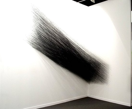
Edith Derdyk, Slice, 2003
4.000 meters of black cotton line, 2.800 stapples and 4 days of setting up
Arco Feira de Arte, Madrid, Spain
photo: Edith Derdyk
To continue on artists that work with string and thread, Brazilian artist Edith Derdyk's work is also absolutely stunning. 


Edith Derdyk, Rasures III, 1998
60.000 meters of black cotton line, 10.000 stapples and 13 days of setting up
City Canibal, curator: Daniela Bousso
Paço das Artes, São Paulo, Brazil
photo: Gal Oppido

It is the visual intensity and the rigorous process of creating the piece that impress and interest me the most. Derdyk's process begins with drawing and the idea of the line, according to the artist.


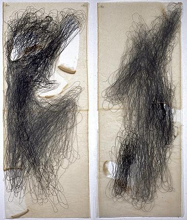
Edith Derdyk, Projects and sketches, 1999/2001
Ball-point pen,
paper

Interlineation, 1998
Drawings
Paper, black cotton line, vinyl glue
50 x 180 cm
photo: Rômulo Fialdini
More of Edith Derdyk's work here.

This is quite a full on description of her work by Arnaldo Artunes in his mini essay Cocoon, found here:

It all started with the paper being torn. After drawing for many years, and also after drawing with thread (adding its material meaning to its use – threads made of threads) as if embroidering the surface of the paper, Edith began to open incisions, filling them with blçack thread, in a paradoxical gesture – tearing so that the sewing could appear beneath the tearing) not the sewing of the tearing, but a sewing beneath the teraing), like surgical sutures within the deepest skin layers. The result were organic suggedtions, many times sexual (vaginas, incisions, wounds; the obscenity of interanl hair under the beardless surface of the paper). Then these incisions started to swell, as if the stitches were inflaming. The wounds that Edith had opened, suddenly became tumors, with ever more stretched relieves. Dark bulbs that leaped from within the translucid and delicate skin of the rice paper, with its dark lines keeping something that is always about to leak. As if paper were live bodies, from within which, depending on the depth of the tearing, some sort of guts would have to leap.
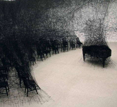
Chiharu Shiota, In silence, 2009 
centrepasquart, biel bienne, switzerland
I have also had a huge crush and massive respect and awe for installation and performance artist Chiharu Shiota, who's work is short of absolutely gobsmackingly spine chillingly god damn spectacular and who recently exhibited at the 'detached' gallery in Hobart that I sadly missed.  Above is a 2009 piece from In silence, a progressive art/installation piece that has been erected and showed at a number of different locations since 2007 when it was part of a performance at the Kanagawa Arts Foundation, in Kanagawa, Japan. (below). Of course, the process of making this space, the setting up and weaving of the wool is of particular interest for me but also the intent of Shiota, who wants to depict the sound of silence in space.Very beautiful.


In Silence, Toshi Ichiyanagi x Unit2007, found here


Chiharu Shiota, "In Silence" (2008). Piano, Chairs, Wool

5/16/2011

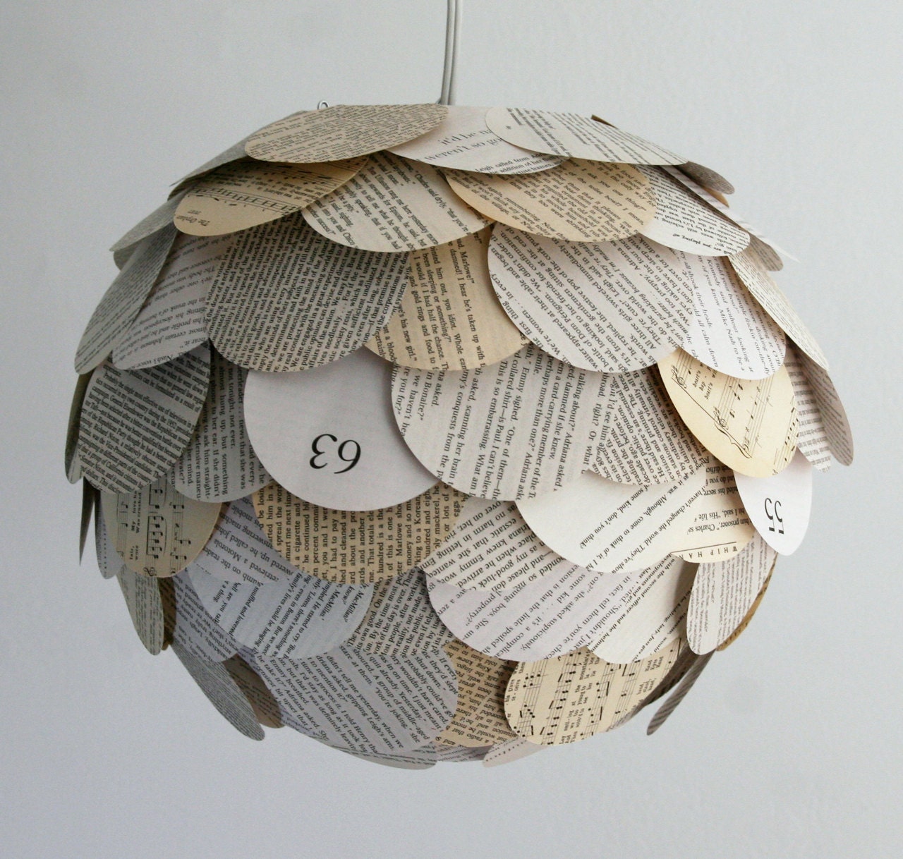
Artichoke Mixed Book Page Pendant

paperback pendant

Allison Patrick, a recent graduate from architecture school in New York City has come up with this thes gorgeous lanterns and pendants made out of old paperback pages and other materials. I love the reuse of materials for a different purpose. It is a clever, economic and environmentally sound way of designing. Good on you girl! The hardest thing to do in design seem to be the remaking of one material and its function to a completely new role, form and function. The reason being that the initial purpose is so etched into your mind that I reckon it takes a lot of creativity to be able to step away from this preconceived idea of what the object or material is and to completely transform it.

pendant made out of white sheet paper, individually cut!


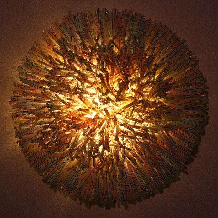
lamp shade made out of drinking straws


5/09/2011

Truth Windows, Framing Landscape and Nonlinear History

Truth windows
According to bldgblog and dornob amongst others, truth windows are windows revealing the inside of straw houses. According to wikipedia, it is constructed so to confirm and reveal that the walls of a house are in fact built with straw bales. Further information about where and how this tradition unfolds remain unknown to me but one can make quite the speculation on where to take the idea.
Over at Bldgblog, Geoff Manaugh suggest that one could install look windows to allow:
Everyone to peer down into subterranean infrastructure, exploring subways, cellars, plague pits, crypts, sewers, buried rivers and streams, scanning back and forth through the foundations of missing war-destroyed buildings, even zeroing in on lost ships.
This framing of the historic city would be like an urban landscape museum, unique to each one of our urban environments. Tabula rasa doesn’t apply here, it is a concept that I find hard to link in the first place to landscape because of landscapes’ richness and continuous growth and change.

Joseph Cornell and his box assemply art springs into mind when thinking about framing an environment. Cornell created the most intriguing little environments in his boxes, narrating a story from assembled objects. This is a way of framing a throught, framing a story, framing an experience and framing a design. The composition of exquisitely extraordinary ticky tackies.
Joseph Cornell

The framing of a past time can also be identified with the concept of a non –linear history. Meaning that time is not just one continuous linear progression but instead more of a circle of growth, decline, death and growth once more. I'm inspired by a recent talk by lovely architect Jan Gehl of Gehl Architects in Denmark at the Melbourne Conversations last week and to give you an idea of what the heck I’m on about and elaborating on Gehl's talk, the idea of pedestrian and bicycle friendly urban cores is not a new idea is it?  We saw the industrial revolution changing the way most of the population understood cities and the development of them through the incorporation of the motor vehicle.

sprawl illustration by Andrew Dyson in theage

Large, sprawling built environments consisting of suburban houseing and road infrastructure for cars and trucks. Walking and bicycling was handed down to kids to do on their quiet suburban street, ushered out by their parental generations because this was a heritage that they still had to hand down to their offspring even through their reliance on the car had completly submerged them into a life void of any significant physical activity apart from pushing a shopping trolley around in the local supermarket.

Cecil Street bike lane. Melbourne, Australia
Copenhagen determination and inspiration


What a good things this was, teaching the suburban kids to bike. Because today we see a shift in the way that people perceive and propose the city to be like.
Urban dwellers are calling for a shift in infrastructure development, they are calling for a slowing down of pace and consequently a narrowing down in scale. Politically, environmentally and economically this issue is framed through peak-oil shortages and ecological+biological pollution. And this framing influences our cultural desires at large.

This particular progression is a rethink of a linear history and an introduction to a non-linear history. Urban dwellers are wanting more pedestrian and bicycle focused infrastructure and more and more they are asking for locally sourced food production and produce. This is an obvious shift in scale for those who design the city...the landscape architect being one of them. 

City of Sydney proposed separate bicycle lanes 2007


 So there it is, the non-linear history that I am talking about. Framing urban development by doing a 360 through our recent histry of mankind and the way we live in our urban environments.

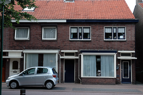
Speaking of framing urban landscapes, it reminds me of a trip I took to the Netherlands as part of a study tour when I was at uni. Dutch society have their own ‘truth windows’. Since their population density is sky high, they have had to adapt a very liberated view on privacy and the public exposure of their own domesticity, the everyday home has become a spectacle. Strolling down the street, you look into a series of large windows and the average family living room. I’ve heard that architecture and the domestic decoration that comes after this have been turned into an art form for the Dutch.


image via caribb on flickr


Dutch Canal Houses via here


Anyway, I’ve been secretely peeping into people’s homes for years, when I was living in London I remember sitting on the top deck of the red buses so that I had a good view into the first floor of your typical london suburban row house. I will continue looking through and into things until the day I die. It is a wonderful childlike curiousity and a desire for close observation that I want to maintain throughout my life and through my practice as a designer. I love looking into and through things, it fells almost forbidden and not supposed to be done but there is something intriduing and mysterious about looking through something, whether it be a frame at the urban landscape museum exposing old sewer or road systems (which I might just do a design for, imagine the different museums in different cities, even different neighbourhoods!), box construction art or someones living room.

There is also a sense of superiority when it comes to this kind of observation because you asw the viewer seem to have control over the viewed, in the urban landscape museum for example, a sense of society having progressed and at the same time there is a humbleness and interest in someone else’s reality, the smaller scale, the detail.

So there you have it, I’ve gone from the making of a window in a straw bale house, to artistically framing a journey through assembly art, to the ability to observe domestic life and design through residential architecture, to urban landscape museums and the idea of a non-linear history in urban development.
Related Posts Plugin for WordPress, Blogger...